Executive Summary
Grip Ezee, a well-known supplier of durable work gloves, was seeing great interest on their website — people were browsing products, adding items to cart, and coming back frequently. But there was one major hurdle: customers were dropping off right at the checkout.
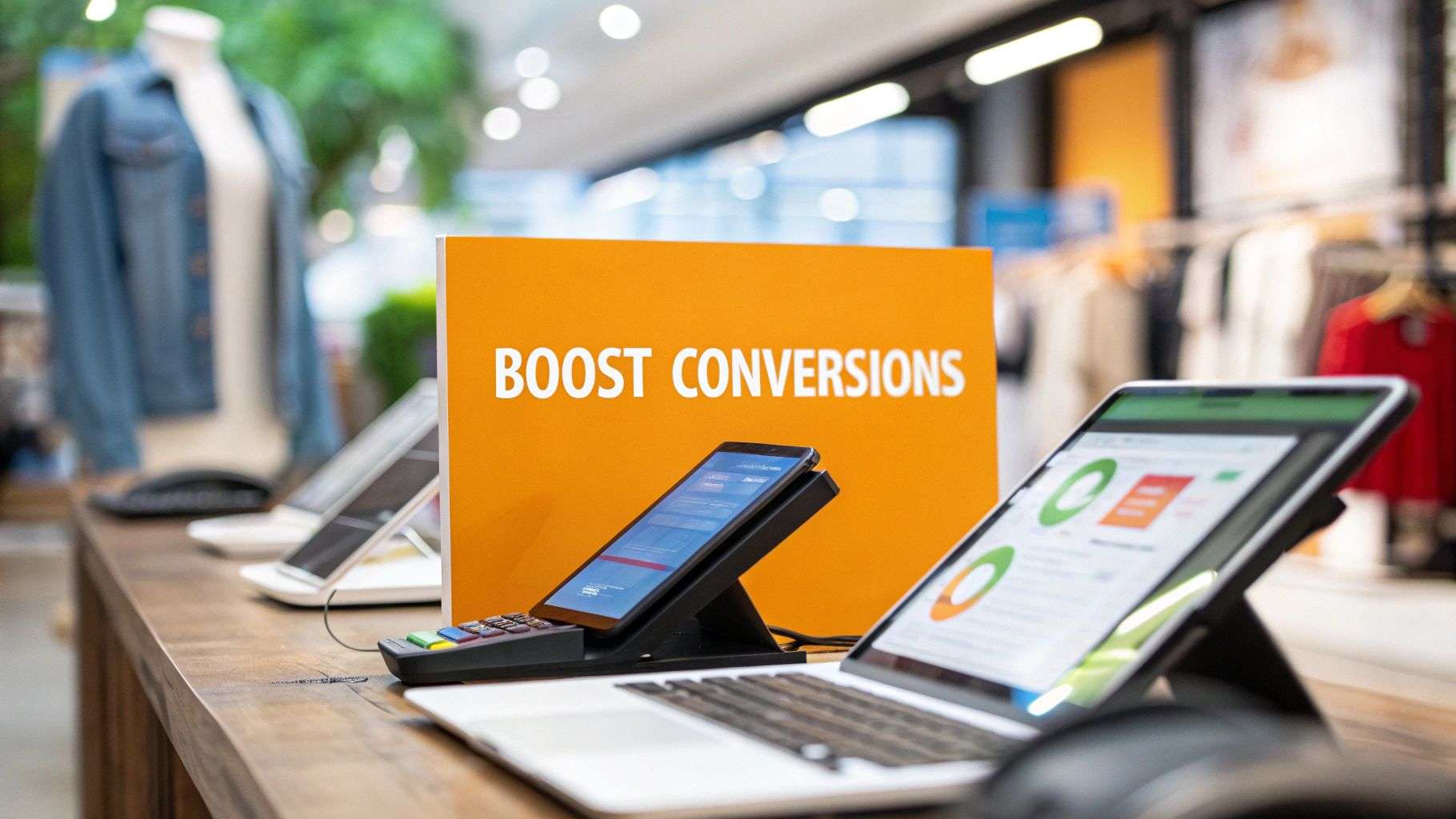
To solve this, OWLSystems stepped in with a simple idea — make buying easier and faster. Through a thoughtful approach focused on user experience, we introduced a streamlined one-click checkout flow that cut down time, reduced friction, and made repeat purchases effortless.
Within a few weeks, the brand saw noticeably faster checkouts, fewer mobile drop-offs, and a clear jump in conversions. A small change made a big difference.
Client Background
Grip Ezee has built its name by offering reliable, high-quality work gloves to both individual buyers and large trade customers. Many of their customers order the same products repeatedly, which makes convenience an important part of their online experience.
With solid traffic and strong product engagement, Grip Ezee knew they had an active and loyal audience. But as more buyers started shopping from their phones, their old checkout system wasn’t able to keep up with expectations. The brand wanted a checkout experience that matched the quality and speed of their products — smooth, intuitive, and frustration-free.
Their goal was simple: make buying as seamless as choosing the product.
Problem Statement
Even though people loved the products, many weren’t completing their orders. After analysing the customer journey, a few issues stood out clearly:
- The checkout had too many steps
- Customers had to enter the same details every time
- Mobile users were dropping off the most
- Repeat buyers found it inconvenient to reorder
- No quick purchase or “buy again” option
Grip Ezee needed a checkout process that respected users’ time and made reordering easier.
Research Methodology
To understand the root problems, OWLSystems followed a step-by-step research process:
- Understanding User Behaviour
We studied analytics, behaviour patterns, and heatmaps to see exactly where customers were facing friction.
- Mapping Customer Flows
Since repeat buyers made up a big share of the audience, we focused on how they moved through the checkout.
- Reviewing Technical Setup
We checked the existing platform to understand what could be improved without disrupting live operations.
- Designing the Solution
We prototyped a smooth, one-click checkout experience that removed unnecessary steps.
- Building & Testing
We tested everything thoroughly — functionality, load handling, and mobile responsiveness — before releasing the update in phases.
This approach ensured the transition was smooth and safe.
Solution
Our goal wasn’t just to “add a feature,” but to create a checkout journey that felt effortless.
- Custom Magento Module
Built a lightweight Magento 2 module that replaced the multi-step checkout with a smooth one-click flow, fully aligned with Magento’s core architecture. - Secure, Tokenized Payments
Used Magento Vault to enable tokenized payment methods, auto-filled customer details, and PCI-compliant instant checkout without storing sensitive card data. - Smart Automated Checkout
Implemented server-side logic to detect returning users, validate cart details, and place orders instantly. Added idempotent handling to prevent duplicate orders and a fallback to full checkout for error-free conversions. - Mobile-First Frontend
Optimized Magento’s JS components to deliver a fast, tap-friendly, app-like “Buy Now” experience on product and cart pages. - Seamless System Integration
Ensured smooth compatibility with Magento’s cart engine, order workflow, payment gateways, promotions, taxes, inventory rules, and email notifications. - Performance Validation
A/B testing showed a noticeable uplift in conversions for returning customers using the one-click checkout option. - Scalable Architecture
Designed the module for future features such as subscriptions, auto-reorder, multiple saved cards, and advanced mobile UX enhancements.
Results / Outcomes
The impact was visible almost immediately.
What Improved:
- Checkout time reduced by 20–25%
- More repeat customers completed their orders
- Mobile cart abandonment dropped by 18%
- Overall order completion increased
Customer Reactions:
- Buying became smoother
- Fewer customers contacted support for checkout issues
- The system handled peak traffic better than before
Conclusion / Discussion
What started as a checkout problem turned into an opportunity for business growth. By removing unnecessary friction and putting customers first, Grip Ezee was able to boost conversions and improve satisfaction.
Key Takeaways:
- Small improvements in usability create big changes in performance
- A mobile-friendly checkout is essential today
- Repeat customers value speed the most
- You don’t always need a full website overhaul — smart upgrades can do the job
What’s Next:
- Add subscription or auto-reorder options
- Further refine mobile checkout interactions
- Use personalised prompts to encourage quick reorders
OWLSystems Closing Note
At OWLSystems, our focus is simple — help brands grow by making their customer journeys smoother and more intuitive. If your checkout experience is slowing down conversions, we’d love to help you transform it into a strength.
Want to improve your checkout performance?
Let’s talk and build something better together.